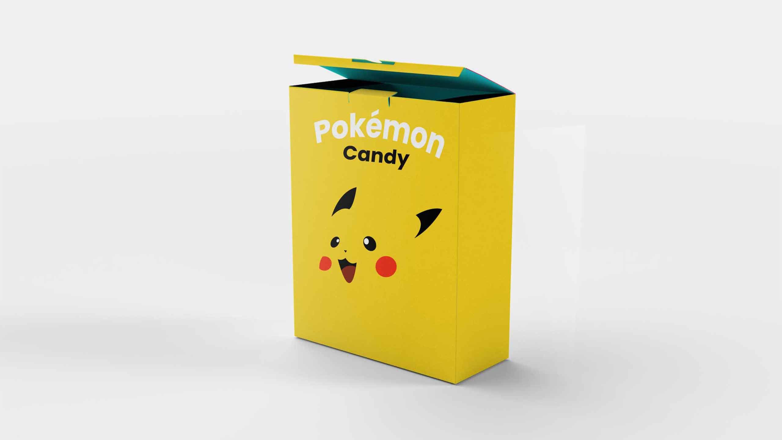

Gestalt principle ´´closure´´
By using the Gestalt principle closure, I came up with a modern design where the target group recognizes the whole Pikachu shape, whilst there only are a few basic shapes. This modern design targets the young adults target group that hopefully will buy this candy
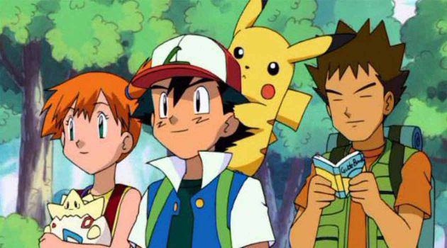
Name recognition
Who has never heard of Pokémon? So off to a good start when it comes to name recognition of the candy.
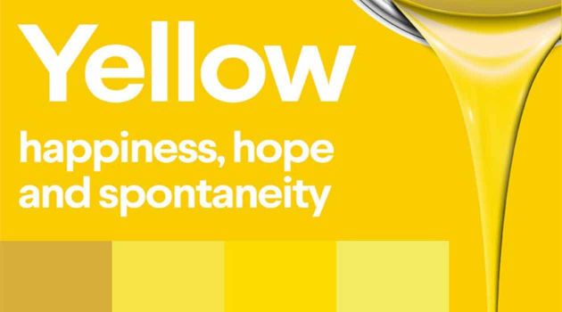
Bright colors
I chose bright colors in order for my candy to stand out in between all the other candy possibilities within a store´s candy department. I chose yellow because it is uplifting and illuminating, offering hope, happiness, cheerfulness and fun. In the meaning of colors, yellow inspires original thought and inquisitiveness.
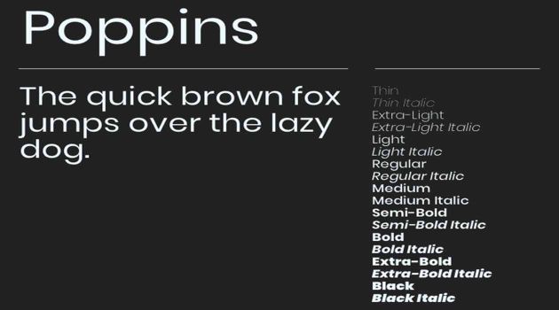
Modern font; Poppins Bold
I chose to go with a modern Sans Serif font, to get a warm feeling, that leans into the same happy feeling you get whilst thinking of Candy, yet at the same time mixing with our modern design. I considered having a more ´´Candy´´like font Ageta Chubby font or Candy Pop font, but It clashed with my modern minimalistic design.
Project Candy

Now we´re talking!
The biggest assignment up to this point. We where told we should come up with a candy concept, while doing so we had to work with target group analysis, mood boards, packaging, and poster design. This project had a strong focus on communication and presentation, two incredibly important pillars within the design world.
The case was as followed; Our ´´boss´´ has gotten an offer for a 1000 pieces of packaging, and we were allowed to co-decide what the contents, name, target-group and design should be.
So the very first thing we had to do; was go out and research! What was there already, what kind of approach to grab your attention had already been tried, and what approach would I take?

What things needed to be done?
-
1.
Research
-
2.
Make a mindmap
-
3.
Make a mood-board
-
4.
Sketches
-
5.
Poster Design

Mindmapping
We were divided into groups, and the first order of business was to come up with a candy concept. A huge part of the ´´Design process´´ is idea generating. Now whether that is through a 1000 post its on an idea board, or If you use a mindmap, that is a matter of one´s personal style. We, as a group, used a mindmap to get acquainted with the process.
Loads of ideas where thrown around, under the concept of : No idea is too crazy. The possibilities were endless, and loads of fun ideas were brought up.
I ended up feeling I wanted to do something with a ´´collectors´´ possibility to it, maybe something with challenges. Like some crazy flavors. I chose to continue with the ´´collectors item´´ concept behind my candy.

Moodboard
So I knew I wanted a collector´s angle, and now It was time for developing the real idea. I came up with ´´Pokémon´´candy as that is one of the most famous ´´collector´s gimmicks ever´´ And I thought It would be a brilliant concept as the target group of Pokémon candy would be very diversified. The candy would obviously be suited for kids, but it reaches plenty of other target groups.
For example parents, wanting to buy it for their kids as they are collecting the candy. There is a huge diversified age group playing Pokémon, and therefore could be interested in having the candy with them whilst playing It. People who follow pop culture could be interested. And there are plenty of researches proving people love collecting rare items, so even people who might not be interested in Pokémon, could be tempted to buy the candy due to the share ´´rarity´´ behind collecting it.
Man, woman, young, old, anyone could be a target group for Pokémon candy! Recognize the guy in the picture with the big Snorlax?
Sketches
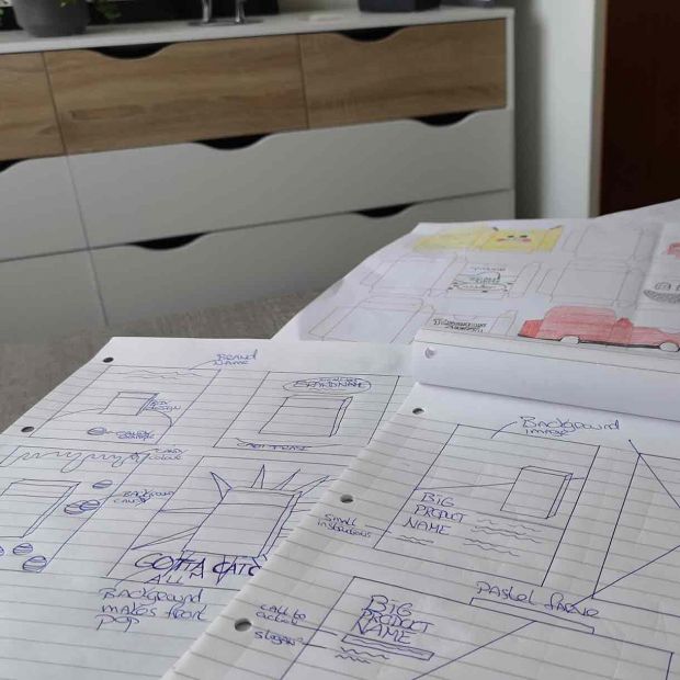
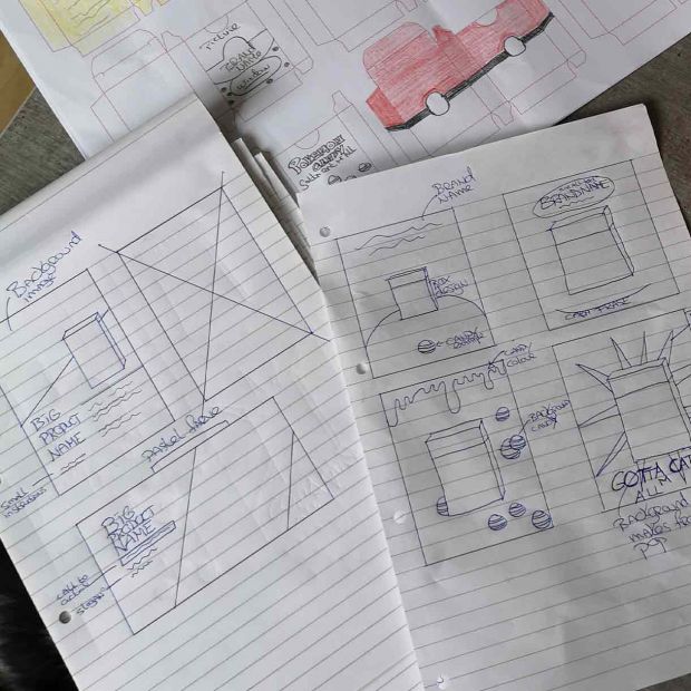
It was time to come up with some sketches! What design would work best on my demographic? Several ideas came to mind, and I tried a variety of angles. I thought a minimalistic approach would appeal to the biggest target group. I wanted familiarity of the product, but mixed with a design that would work for the ´´collectors angle´´
A huge part of the right design was that it should look good whilst standing next to other versions of my candy. As the collectors item was a big part of my concept, I went with a design form that could be applied to different packaging. Making the package look nice, but also making it come together as a group collectors thing.
More sketches
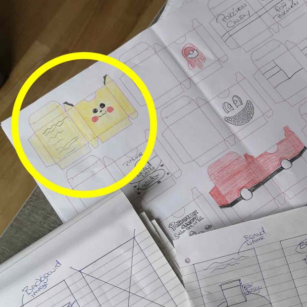
I used the Gestalt principle ´´Closure´´ in my Design where the brain recognizes the famous ´´Pikachu´´, yet only basic shapes where used. The brain fills out the rest. I feel It creates a modern artistic yet playful look to the candy that appeals to the biggest part of the target group. The artistic design is targeted on the desire to collect all the different design packages.
I played around with having a transparent circle within the design, so the candy within would become visible. But I decided that It ruined my minimalistic style. The original Pikachu sketch was a good start, and was the one that led me to my final design. I discarded my other ideas regarding Pokéballs and such, and perfectionated my ´´flat design´´ Pikachu.
Poster Design
One of the most fun aspects of this assignments was that we also had to design a product poster. So If my product was real, how would I portray it at the stores? This was more challenging then I realized. As I went with the flat design style I had troubles matching that with a poster style that would still attract attention.
Due to such a wide variety of target groups, that presented me with unlimited possibilities. And that doesn´t make narrowing down a style easier. But I played around with a few design ideas and styles, and got closer and closer to the final design.
The final design
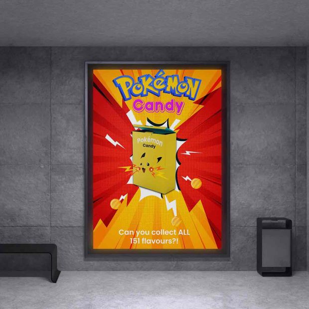
Here It is! The final product design on an attention grabbing poster. From top to bottom, you immediately notice all the things previously discussed. Name recognition; Everyone knows the Pokémon name and logo, so no need for a redesign of the logo for our candy. The font used in the word candy is a specific ´´candy font´´ which is round and soft. This gives people a happy feeling relating to our candy. I also gave it a bright pink color to keep grabbing that attention. The cartoon like background makes it appear the candy box is bursting out of the background, sending a clear message; Look at me!
Looking closer at the design you´ll see a few things pop out, for example some Thunderbolts. These are off course Pikachu´s legendary signature moves, yet they also provide an extra layer to the design. There is movement, there is action. I added some candy examples to the end of the lightning bolts so that It seems like the candy box is bursting with action, and so is Pikachu. As a final touch I´ve played upon Pokémon´s slogan; ´´Gotta cath em all´´ But in the scenario of our candy, I want them to ´´collect them all´´
This design is sure to grab the attention from one of the biggest target-groups, namely children. The font, the colors, the action are also grabbing the attention of the other target groups. It is made in such a way that it doesn´t exclude anyone, and conveys the message; That Pokémon candy is for everyone…
What I learned
This combination assignment of design and presentation has taught me about the many things that lie behind a design concept. I learned not just to communicate, and how best to communicate. Consideration of fonts, what message each font sends, consideration of colors, and the psychology behind them, and the use of demographics. I´m not sure words suffice describing how much I´ve learned from this assignment, and how much It has made me a better designer in every way of the word.