
The Handmaid´s Tale
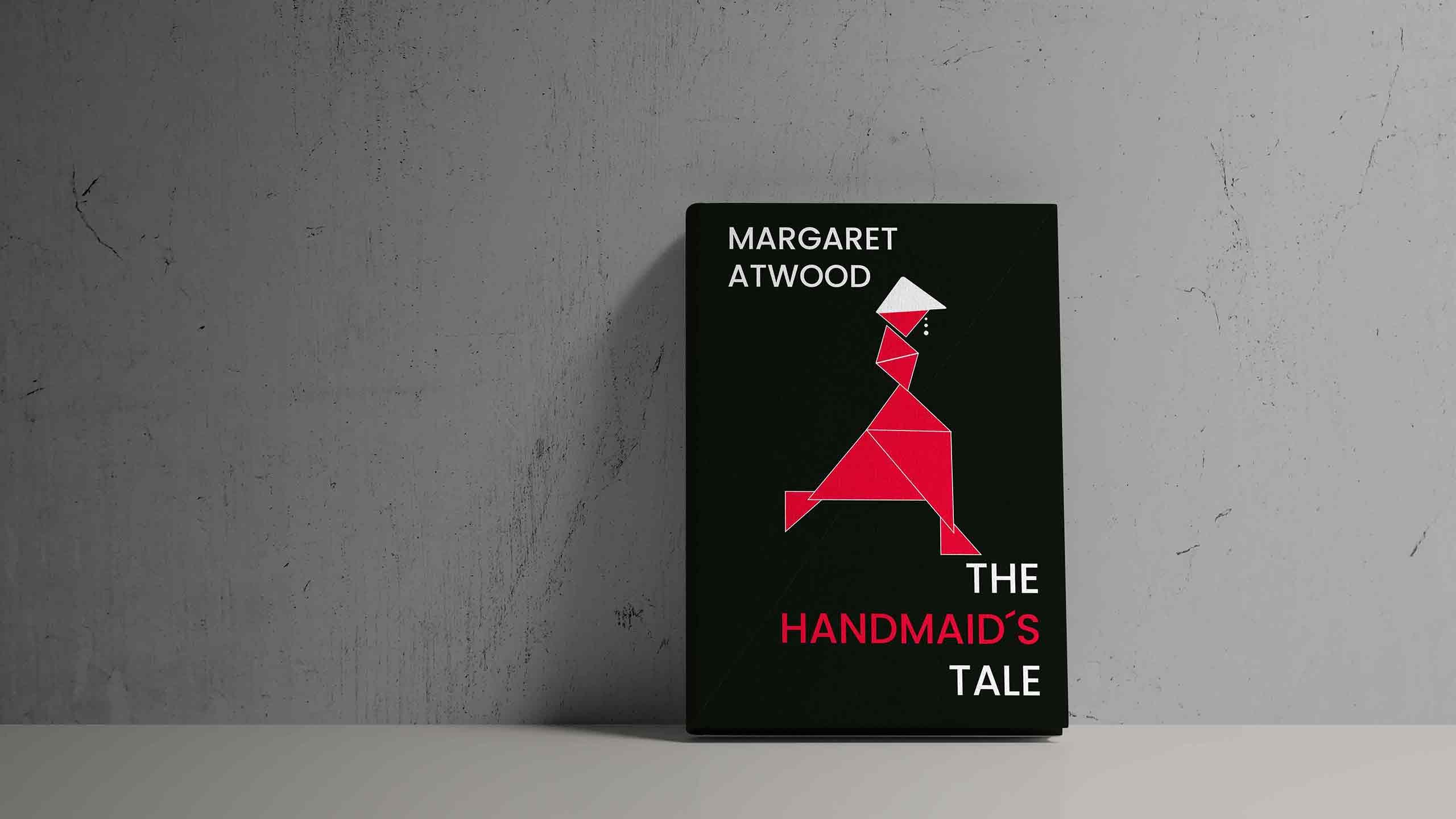
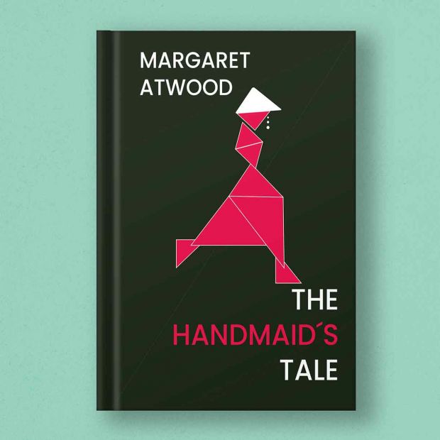
The book I had to make a cover of was The Handmaid´s Tale, knowing the book and the series I wanted my design to portray the dark world they live in, while highlighting their famous dress & hat. Unfortunately red wasn´t part of my pre-determined color scheme, but I still love how the design ended up.
Font; Poppins
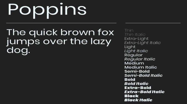
I chose a modern sans serif font, which matched with the style of the illustration. I felt that a serif font wouldn´t match with my simple geometric design. It´s also a font that is easily readable, which is crucial for the book title.

Triangles everywhere
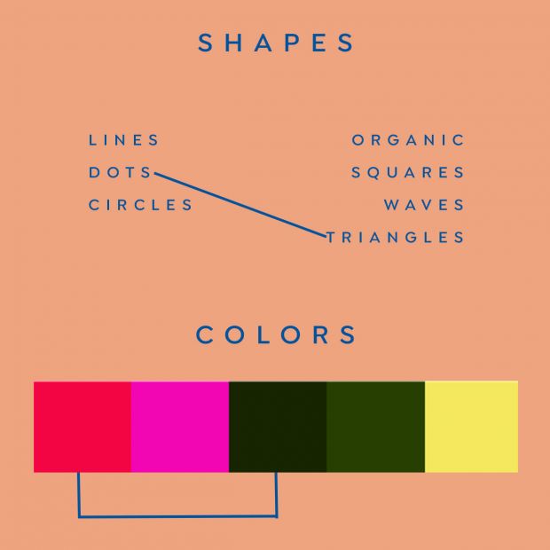
The challenge behind this assignment was that we had to come up with a design based on a book, but we where ONLY allowed to use 2 shapes. I got the shapes Triangle and Dots to work with. O yeah; And did I mention that we also got a pre-decided color scheme to work with?

Mixed methods design
A crucial part of being a designer has to be one´s capability of coming up with creative ideas. Now during this assignment we worked with the concept behind ´´Idea generating´´, and techniques within idea generating. Then we did a deep-dive into one in specific. Let´s call it: ´´mixed methods idea generating´´. Where you takes 2 subjects, mix them together and see what ideas come from that. An incredible useful tool if you have to design a campaign for a customer where a target-group and a design have to be mixed.
During this assignment we were given a specific set of ´´rules´´ to design after. In my case, I had to make a book design about a specific book whilst only using 2 pre-determined shapes. In my case, triangles and dots. I was only allowed to use a pre-determined color scheme.

The idea behind this assignment
-
1.
Learn to design whilst having limitations
-
2.
Apply your knowledge about the crossing method
-
3.
Apply knowledge about color choices
-
4.
Apply knowledge about composition on a real product
Designing with limitations
The challenging part behind this assignment was that I had to come up with a design, whilst only using 2 basic shapes. Which in my case, was dots and triangles. I was also only allowed to use a pre-determined color scheme and it had to be for the book ´´A Handmaids Tale´´.
Now the underlying idea behind this assignment was not lost on me. A future scenario could be that I work at an advertising agency and a client wants a certain design, and the client has a set of demands which you have to follow. Then it´s good to know how to think outside the box. How to generate ideas whilst being limited.
Crossing Designs Method
Ok! A book design about a future dark world where woman get forced into gender roles against their will. They were forced to wear red dresses and white hats. Then comes the task of designing a book cover only using triangles and dots.
I started, off course, with doing some research on what already is out there. In order to glean some inspiration. Then based on what I had to work with, I quickly realized I wanted to work with a flat design style. Simple, classic, and lending itself well to my shapes.
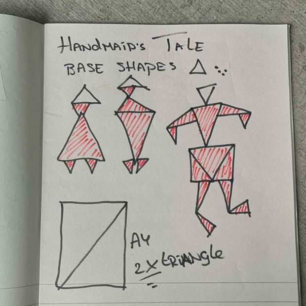
Then I started looking into geometric shapes and how I could apply that to my design. I saw some origami folding patterns, and then an idea was born… What If I would design a female shape, based on triangles, and then with the help of colors I could make it look like the woman from the book. I made some sketches to see If I could turn my idea into reality.

Color knowledge
Now applying color knowledge to a pre-determined color scheme proved to be quite tricky. You don´t have a free range of complementary colors or contrast colors. I wanted to create a dark vibe to match the theme of my book. So I picked the #172601 a very dark green to represent the darkness of the world, in which the book takes place. Now the original color of the handmaidens dresses is red, I was lucky to have a #f20544 available in my color scheme. Which
isn´t really the red I hoped for, but close enough.
That dark green and light red make for a contrast/triadic color combination. Which creates a high contrast, and each color seems brighter in each others presence. The deep dark green makes the light red pop out more, and therefore more focus lies on the iconic handmaid´s dress.
The same #f20544 red from the dress was used in the handmaid´s font, which connects the book title to the book´s illustration. Again highlighting that this book is about the handmaidens with the red dresses. If the reader didn´t know about the book, or series, to begin with, the reader knows it´s about handmaidens in red dresses. Something important is going on there.
Layout and Composition
The font was picked, the colors where chosen, the design was made! Now the whole thing had to be put together in a
lay-out that made sense and conveyed the message perfectly. I tried to design the cover according to the 5 basic principles of layout and composition.
1: Proximity; All the triangles are positioned in such a way that they appear to make the shape of a woman in a dress. The authors name and the book´s title are also placed in groups, so it´s clear they belong together.
2: White Space; I´ve kept the space around the handmaiden to 1 color, which creates a clear contrast between the handmaiden and her background. Further more I´ve also kept a negative space between the text and outer margins, giving my design room to breathe.
3: Alignment; The authors name is left-aligned making sense as It´s on the left side of the book, and I right-aligned the title of the book, as it´s on the right side.
4: Contrast; The deep dark green creates a nice light and dark contrast with the Handmaidens red dress. Highlighting the dress and her white hat, 2 iconic parts from the book.
5: Repetition; I´ve repeated the red from the dress in the ´´handmaid´s´´ part of the title. Showing that the 2 are linked, and thereby linking the book title to the design.

A book about me
After having designed a book according to a set of rules, our fantasy was allowed to be unleashed when it came to the design of yet another book! A book that could portray yourself. An autobiography was created.
A few things came to mind, but I wanted to portray things people knew about me, but with a hint of humor. Now at school I´m pretty much known as the Death Metal guy that hates pop music.(especially when the whole class has to dance to it on a Friday afternoon, an idea my design teacher came up with) So I came up with a design that kept building upon that contrast. Death Metal=black and Pop=pink and I thought It could be fun to show 2 sides of me.
On the left the serious side, dressed in a suit, and on the right the happy relaxed side. This not only shows a contrast again, but was also a very cool Photoshop technique where I had to learn how to work with masks. I tried to apply the ´´Repetition´´ lay-out technique where the pink came back in the authors name and I played around with the color knowledge I had acquired so far.
What I learned
Wow…What seemed like a pretty straight forward assignment turned into a combination of challenging my way of thinking. A repetition of previously learned knowledge. The combination of idea generating techniques, and applying layout composition and color knowledge, made this assignment incredible. From all the assignments described before, and all of those you yet have to read about, this was my favorite!