Responsive webdesign
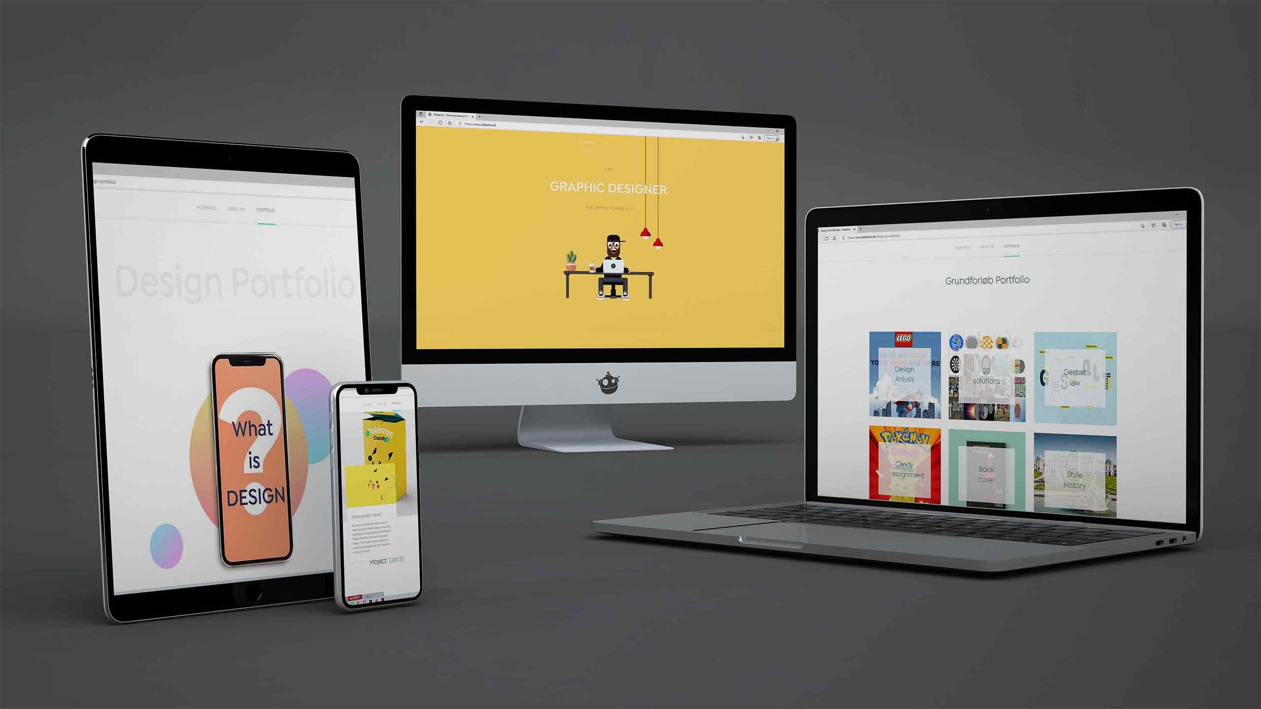
No matter what device you use to look at my Portfolio, It´s designed to be responsive. Whether you look on your desktop, laptop, Ipad or mobile device. I will admit that the design is most beautiful whilst looking on a desktop or laptop.

Tarteletter? No! Tale Teller!
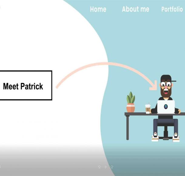
I thought long and hard about the landing page. I wanted to tell not just a story, but my story. I´ve become quite the teller of tales; ergo the name Taleteller, where great stories turn into great communication

Design Portfolio
The most important subject of them all; design. I had to make this design portfolio a piece of art. Cause design is telling a story, and I wanted to make it into a visual experience. That while you´re looking at this and reading this, you´re experiencing it. So in every page of the Design Portfolio something is going on. Animations, illustrations and storytelling all combined into one piece of art.
Clear overview
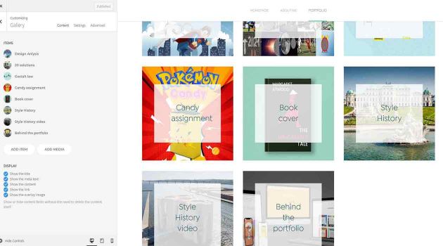
Throughout every part of the website a clear overview was kept in mind. So that no matter where you are, you can always find your way around. And within a few clicks, can get where you want to be. The assignments are all connected with the click of 1 button. User Experience at it´s best.
A portable leaf
The noun portfolio has its roots in the similarly-sounding Latin portafoglio “a case for carrying loose papers.” Notice, within that word, two other words — there’s porta, meaning “carry,” and foglio, meaning “sheet, leaf.” In English, think portable folio, or papers that can be carried.
Now we are far beyond the days where I need to be carrying a leaf around which depicts me. Thankfully we live in the modern age, where we can make beautiful portable stuff like a website. My portfolio is designed to be carried around on whatever piece of technology you´re carrying, and to leave you with a lasting impression of who I am. If I really did my job right, you not only have gotten an impression of me, but also see a certain amount of potential in me now.

Conveying my message
I designed my portfolio in such a way that it tells a story, and the reader gets taken on a voyage. Yet along the way several aspects have been thought of. It´s not just a collection of text and images, it´s a visual experience. I´ve designed a lay-out where my message is clear, but with room for artistic expression. Then I´ve repeated that lay-out throughout every page of my portfolio, so that the reader gets accustomed with the design, and knows what to expect.
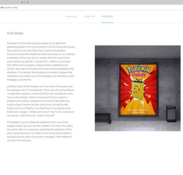
Small animations can be hidden within an image, or header, to keep things interesting. But the part I am most proud of is the way the assignments are displayed. Each assignment starts out with the final product, and upon the final products are always the core values of the assignment. So the reader can follow my journey in an interesting yet fun way.
After the header the lay-out is displayed in a very clear way, a headline, text and image, which change from side to side to keep things interesting.
Layout & Composition
I picked a font called; Isidora Sans, a serif font which has a modern feel, and lends itself incredibly well for large pieces of text. The colors where chosen from assignment to assignment, but there is a general color scheme going on throughout the whole website to create a cohesive effect. Now the whole thing had to be put together in a lay-out that made sense and conveyed the message perfectly. I tried to design the cover according to the 5 basic principles of layout and composition.
This not only kept it possible for me to keep a clear structured lay-out, but also to make it ecstatically pleasing. The idea was to have a story, being told like a story, but with a very clear lay-out like a magazine or a book. So that at the end of the day, the message I want to convey would reach the reader. This was done so with the use of mock-ups to portray the real design as a real product and well chosen text matching these images.

Layout principles
1: Proximity: Text, headers and images are all placed in such a way that you can see what subjects belong together. There is no doubt when you see an image as to what subject it belongs to. And it all ads value to the subject which is being portrayed.
2: White Space: In general I keep a lot of white space in my lay-out. To give the reader a breather, to keep the information to a minimum. As my portfolio portrays a lot of information, it´s mixed with images and white space.
3: Alignment: Text alignment is kept on a left-justify, to keep a clean lay-out when it comes to text. Also the reader is being led from left to right as one would expect. From the top titles down to the text.
4: Contrast: I tried to create a light-heavy contrast where images give the reader a breather after reading so much information.
5: Repetition: The same clean lay-out is repeated again and again, so the reader gets a familiarity with the design, and knows what to expect when reading the next assignment.
SEO, User Experience and User Interface
Now while designing my portfolio, I tried to always keep an eye on 2 things: 1 User Interface and 2 User Experience
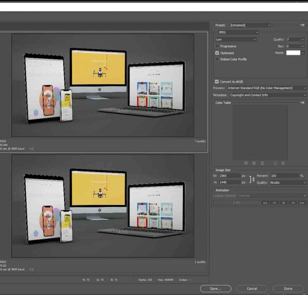
To not repeat too much of what is already mentioned above, I will just mention some details of my designs that aren´t discussed yet. A huge part of user experience is how the reader experiences my website (my portfolio) Now since my portfolio is filled with text, that is usually not a problem. But my portfolio is filled with mockups, and edited Adobe program images, which tend to have big files. Big files = slow loading times which in return = one annoyed reader.
I went the extra mile here; whilst uploading pictures to my website, I would always make sure that they are cropped exactly to the picture they were meant for. The images are all exported into a smaller size, to keep loading times fast and user experience a nice experience. A little detail of user experience is for example the ´´next assignment´´ button on the bottom of each assignment. Sparing the user having to click back and forth through menus.
Did you have fun?
I hope it was a positive experience going through my portfolio, and that it portrayed who I am, how I work, and possibly what kind of designer I will be in the future. Or as I like to say, I hope I´ve portrayed my potential. This portfolio is an example of how much I´ve learned during my school term. I started school with 0 design experience, and along the way have not only been formed and shaped by school, they made me a better designer. And we have only just began.