A magical font
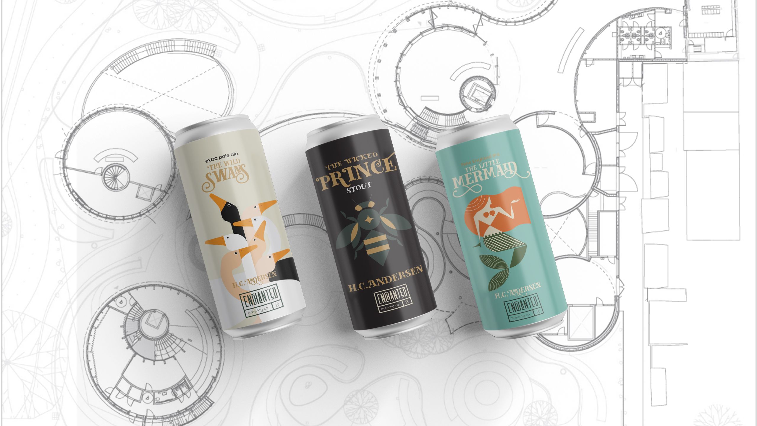
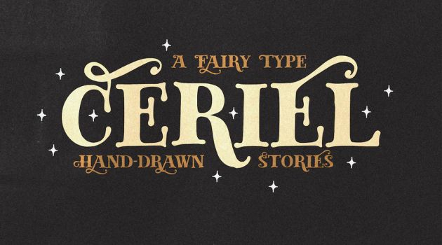
Ceriel is a captivating hand-drawn sans-serif font that seamlessly weaves the enchanting essence of fairytale books into its design.
Inspired by the intricate lettering found within the pages of cherished fairytales, Ceriel embraces a timeless charm. Its flowing lines and playful curves emulate the calligraphy of storytellers, making it a perfect choice for adding a touch of whimsy to this design project.
Geometric shapes
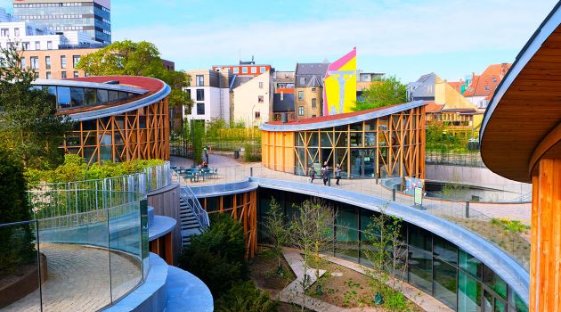
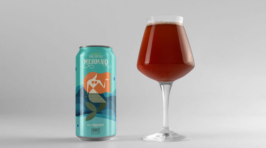
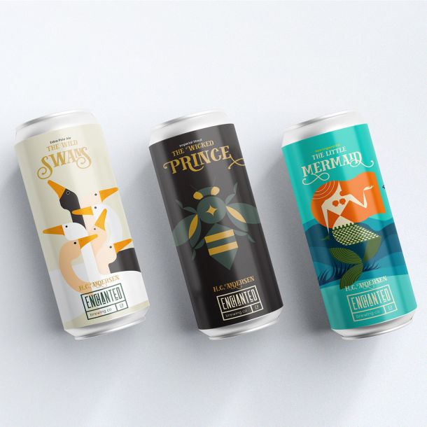
The illustrations created to showcase the famous fairytales of HC. Andersen were done so with Geometric Shapes. This is to embody the feeling of the client; HC. Andersens House, a modern museum built with Geometric Shapes.
Logo Design
Enchanted is a made-up company for this assignment, but a modern company that is known for its exceptional craft beers that are brewed with passion and creativity.
The logo is a modern logo that matches the new brewing company called Enchanted, it used a modern yet enchanting font for the name Enchanted, and uses Poppins, a Geometric font for the brewing co words.
Brewing Magic: HC. Andersen’s Fairytales
Beer Labels
2022/04/18
Hansenberg, Kolding
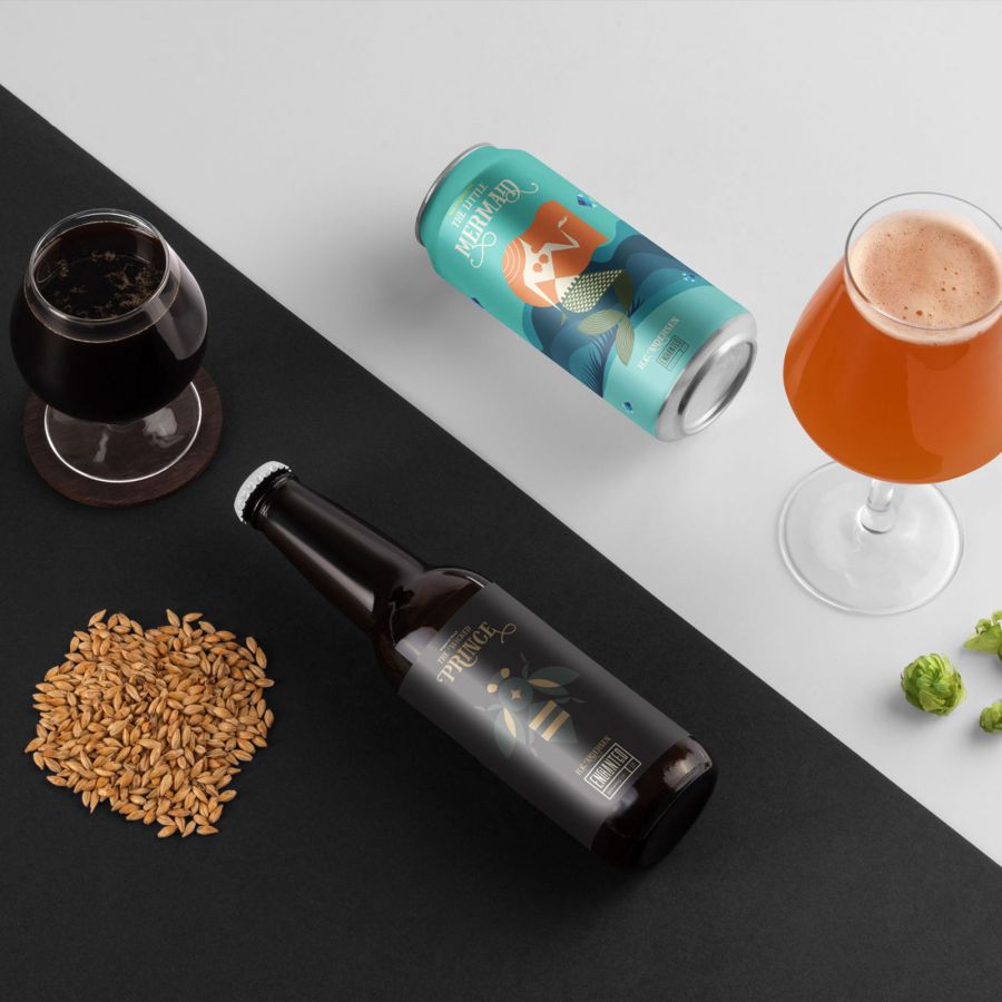
Objective: For this school assignment we had to develop several products based on a sight in Denmark. The sight would function as our potential client, and the client wanted me to develop 3 beer labels in order to market their sight.
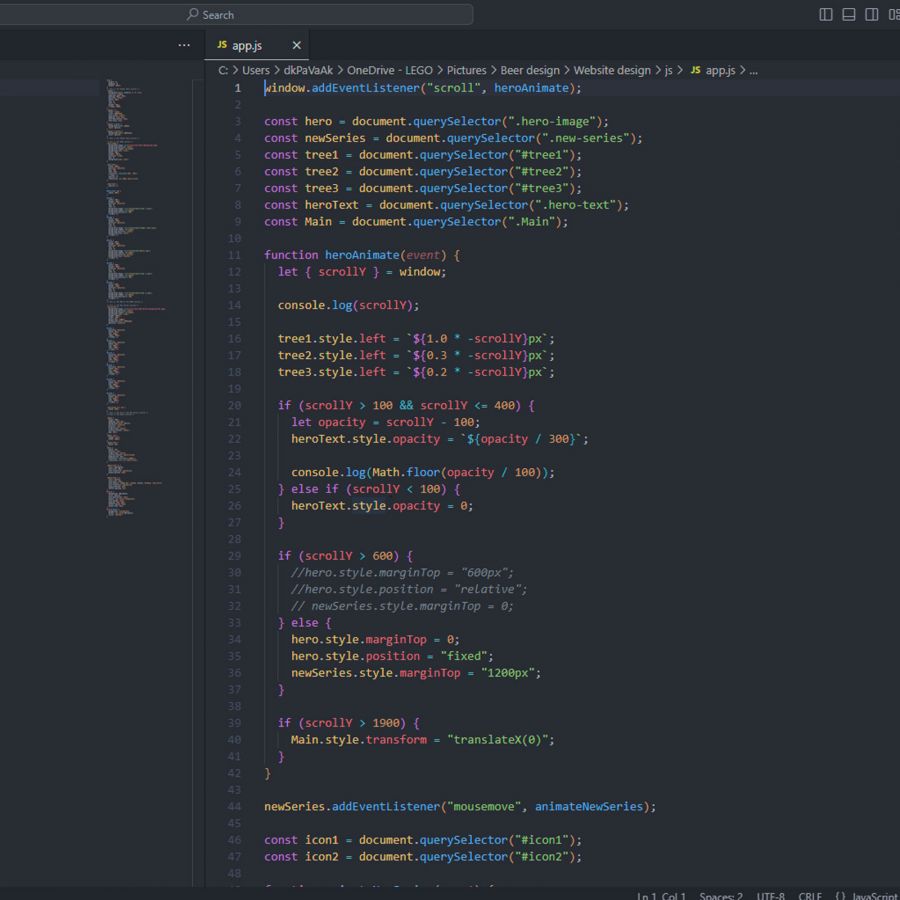
I picked the newly opened H.C. Andersens House, which is a modern museum which showcases art from artist around the world in a tribute to H.C. Andersen. We had to develop 3 beer labels, a brochure,a marketing video with English speech that you had to record yourself, and a website with parallax effect using HTML, CSS and Javascript.
The challenge
The primary challenge in this project was to seamlessly blend the rich cultural heritage and artistic legacy of H.C. Andersen with the contemporary world of craft beer. This demanded a harmonious fusion of tradition and modernity, as well as the ability to capture the essence of the modern site while appealing to a diverse audience of beer enthusiasts.
The solution
To address these challenges effectively, the project required a combination of creative vision, cultural sensitivity, extensive research, and a deep understanding of both historical and contemporary design principles. This case study will delve into each of these aspects to showcase how the design process navigated these complexities to produce a successful set of beer labels and associated promotional materials inspired by H.C. Andersen’s House.
Beer labels
Fusion of Tradition and Modernity: We achieved a harmonious blend of the historical and the contemporary by juxtaposing classic architectural elements of H.C. Andersen’s House with modern design elements. This juxtaposition allowed us to create visually striking labels that appealed to both tradition enthusiasts and the younger, craft beer demographic.
Cultural Sensitivity: Extensive research on H.C. Andersen’s life, works, and the cultural significance of his house ensured that the labels paid respectful homage to his legacy. The use of Danish folklore motifs and storytelling elements further connected the labels to Andersen’s literary world.
Regulatory Compliance: We collaborated with legal experts to ensure that all labeling adhered to Danish and international regulations for alcoholic beverages. This ensured that the labels were not only visually appealing but also legally compliant.
Brochure
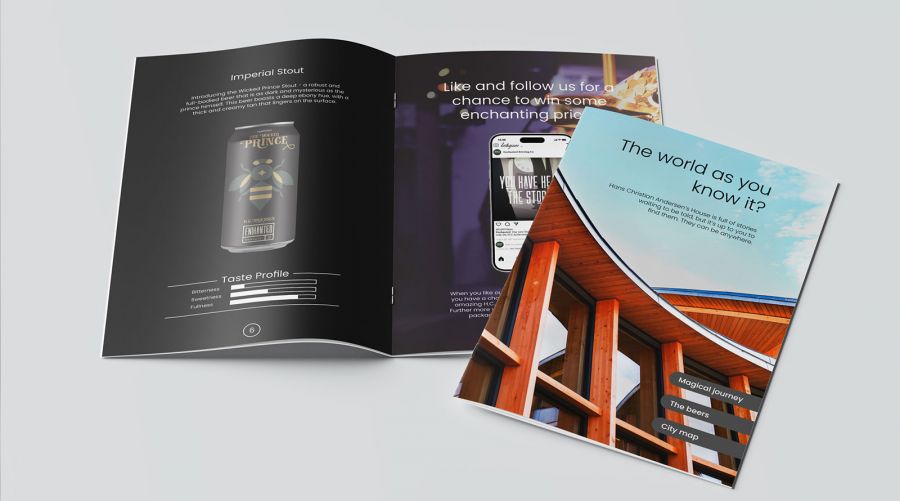
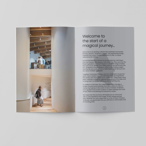
Storytelling Through Design: The brochure was designed as a storytelling tool, taking readers on a journey through the history and significance of H.C. Andersen’s House. I used a combination of evocative imagery, informative text, and a cohesive color palette to create a visually engaging and informative piece.
Cohesive Branding: Consistency with the beer labels was maintained to create a cohesive brand identity. Elements such as typography, color schemes, and graphic motifs were carried over from the labels to the brochure, reinforcing the connection between the two.
Interactive Elements: QR codes were strategically placed throughout the brochure, linking readers to the website for a more immersive experience. This interactive approach bridged the gap between print and digital media.
Marketing Video
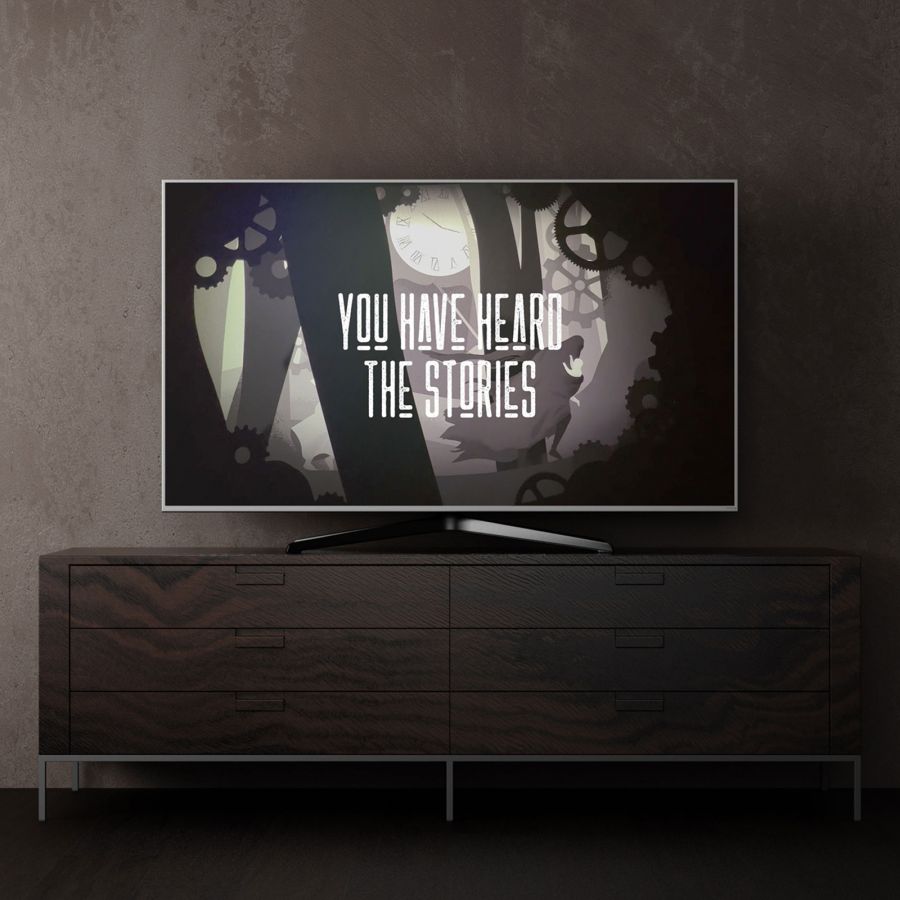
Visual Storytelling: The marketing video was designed to tell a captivating story about H.C. Andersen’s House and its connection to the beer. A combination of cinematic visuals, narration, and music was used to create an emotional connection with the audience.
Showcasing the Magic: To highlight the magical aspect, we included segments in the video showcasing the storytelling of H.C. Andersen. This helped bridge the gap between the historical theme and the contemporary product.
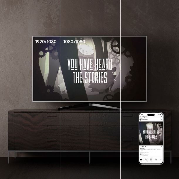
Engaging Promotion: Social media platforms were leveraged for the video’s promotion. The video was tailored to the traditional 1920×1080 video format, but designed in a way that 1080×1080 showcases the video as well. This was in order to block out other material from the viewers feed, so all focus remains on the video.
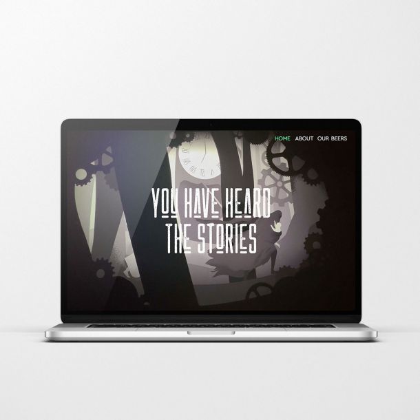
Website with Parallax Effect
Immersive Experience: The website was designed to immerse visitors in the world of H.C. Andersen’s House and the beer. Parallax scrolling was used to create a dynamic and visually captivating experience that mirrored the marketing video.
Responsive Design: Ensuring the website was responsive across devices and browsers was crucial to reach a wide audience. The design incorporated adaptive elements to maintain a seamless experience on both desktop and mobile platforms.
Integration with Other Materials: The website served as a hub for all promotional materials, linking to the beer labels, brochure, and marketing video. This ensured a consistent brand message and easy access to additional information.
Each of these solutions was carefully tailored to address the challenges and objectives of its respective project component, resulting in a cohesive and impactful promotional campaign for the beer inspired by H.C. Andersen’s House.
And now for your viewing pleasure; the video