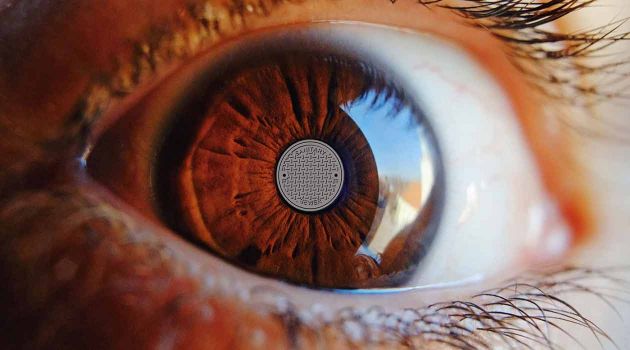
Image combined with illustration
In this image I played with shapes. The man hole cover being circle shaped lend itself well to circle shaped forms. Like for example in this one It became the eye´s iris.
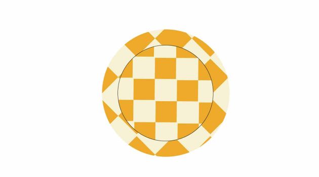
Complementary colors
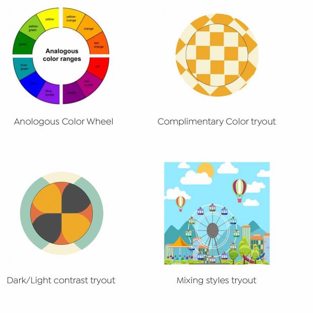
This was my attempt of designing something with complementary colors. I choose a darker orange and a very light yellow.
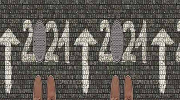
Dark & light contrast
In this image we have several dark & light contrasts going on. The white painted numbers on the dark grey background make the numbers pop out, mixed with the manhole cover that ends up representing the number 0. The manhole cover being light grey also separates nicely from the dark grey background.

Mixing vector and image
In this illustration I tried to mix the vector illustration with the real life man hole cover. But the man hole cover works as the center point of the ferris wheel. It was mostly a challenge of creativity, not really color related.

A challenging assignment
Now you might wonder over the choice of words I used here; A challenging assignment I call it that because this was an assignment where we got tested on our endurance, our creativity, and our knowledge of colors. Which admittingly, my knowledge of colors before starting the assignment was limited. I had heard a little of contrast colors and so on, but didn´t know much about them.
I started with how you start every project, with the most important part; research. Are there any previously made designs out there, any things to get inspired by?
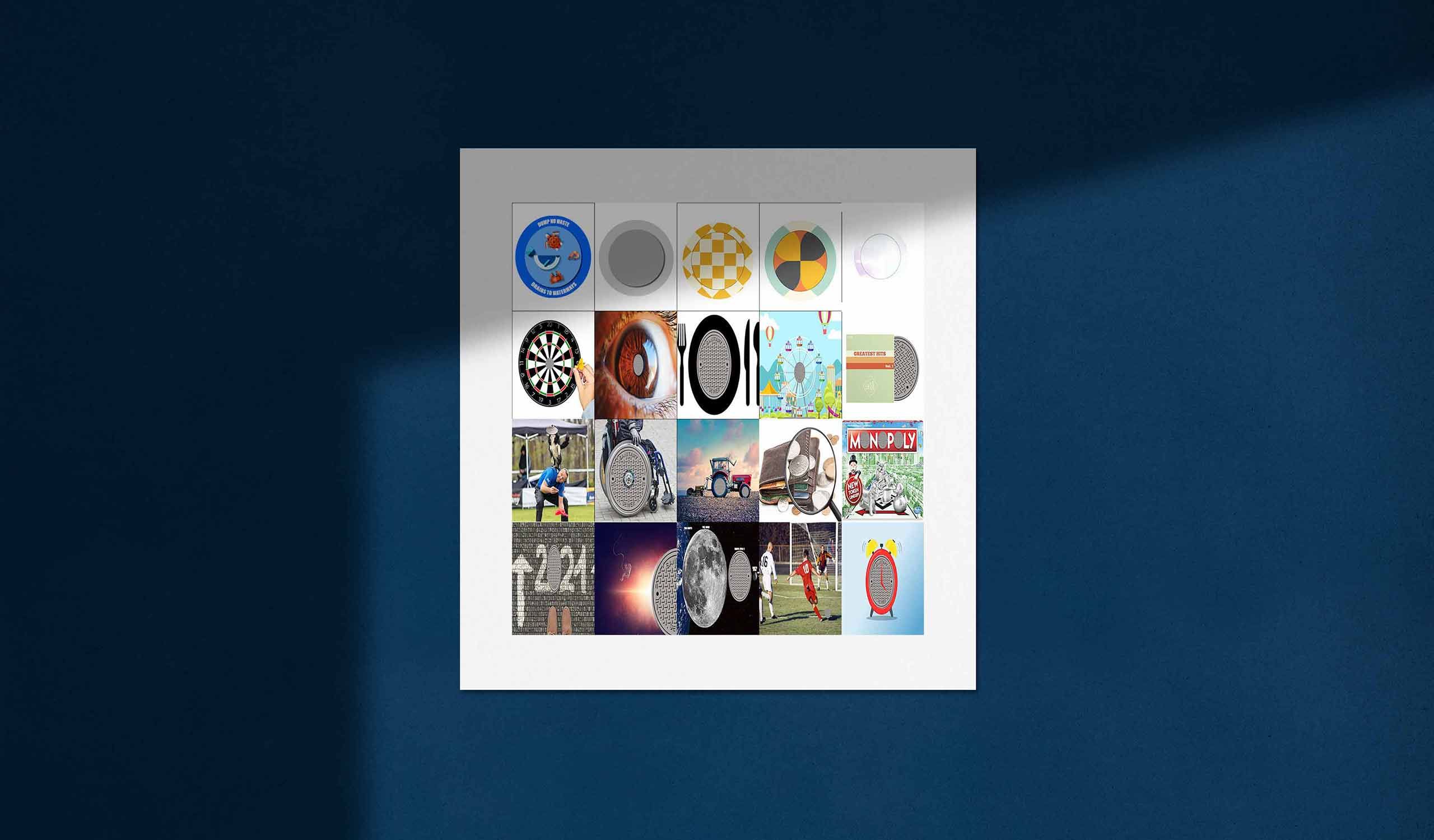
If you hover over the header image you will find my favorite designs amongst them.
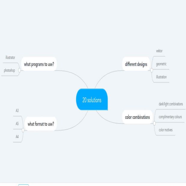
Mindmapping
-
1.
I started with mapping what I needed for the assignment
-
2.
What designs will I use? Vektor, geometrics, illustrations?
-
3.
Obviously color combinations had to be chosen
-
4.
What programs could I design in?
-
5.
And what format should I make the document in
Let’s go!
Ok! Now that I was inspired it was time for some sketches. I had chosen the Man Hole cover as my subject, and had to make 20 different design styles of a Man Hole cover. I admit I wasn´t very good at putting sketches on paper, but I tried drawing in the programs. I could tell right away that I was better at drawing within the Adobe programs, then sketching on paper.
Some I designed in Illustrator, and some in PhotoShop. It was not the making of designs which was my biggest challenge here, it was understanding the choices of colors. Why certain colors mixed well together, and why certain didn´t mix. I was quite new to the different aspects of color combinations.
During this assignment I learned about the importance of contrast colors, the strong effects of a light & dark contrast and how to use analogous harmony colors.
What I learned
This was possibly the assignment where I felt most challenged, due to my inexperience with the fundamentals behind design. This assignment has taught me the importance of colors, the psychology behind them, and how to use them properly.